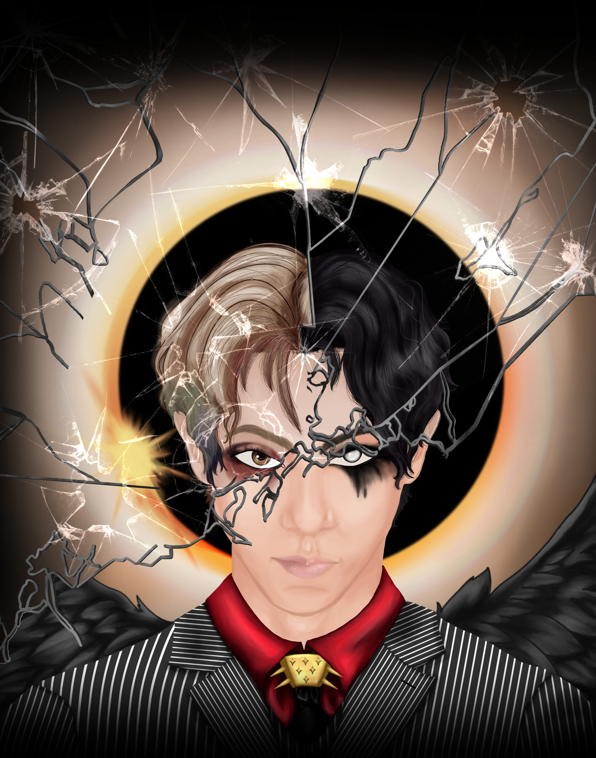
The Stories of DPR IAN
This custom illustration was created as a heartfelt gift for the musical artist DPR IAN. The artwork intricately portrays a vivid narrative, drawing inspiration from the characters and themes that appear throughout his songs and music videos. Each element in the piece reflects a different aspect of DPR IAN’s artistic world, carefully crafted to capture the essence and emotional depth of his work.
Rendered digitally using Clip Studio Paint on a Huion Kamvas Pro 16, this piece blends expressive character design with a rich, moody color palette to echo the tone and storytelling found in DPR IAN’s music. The attention to detail in the characters and background elements was aimed at creating a visual representation that resonates with the narrative style of his art.
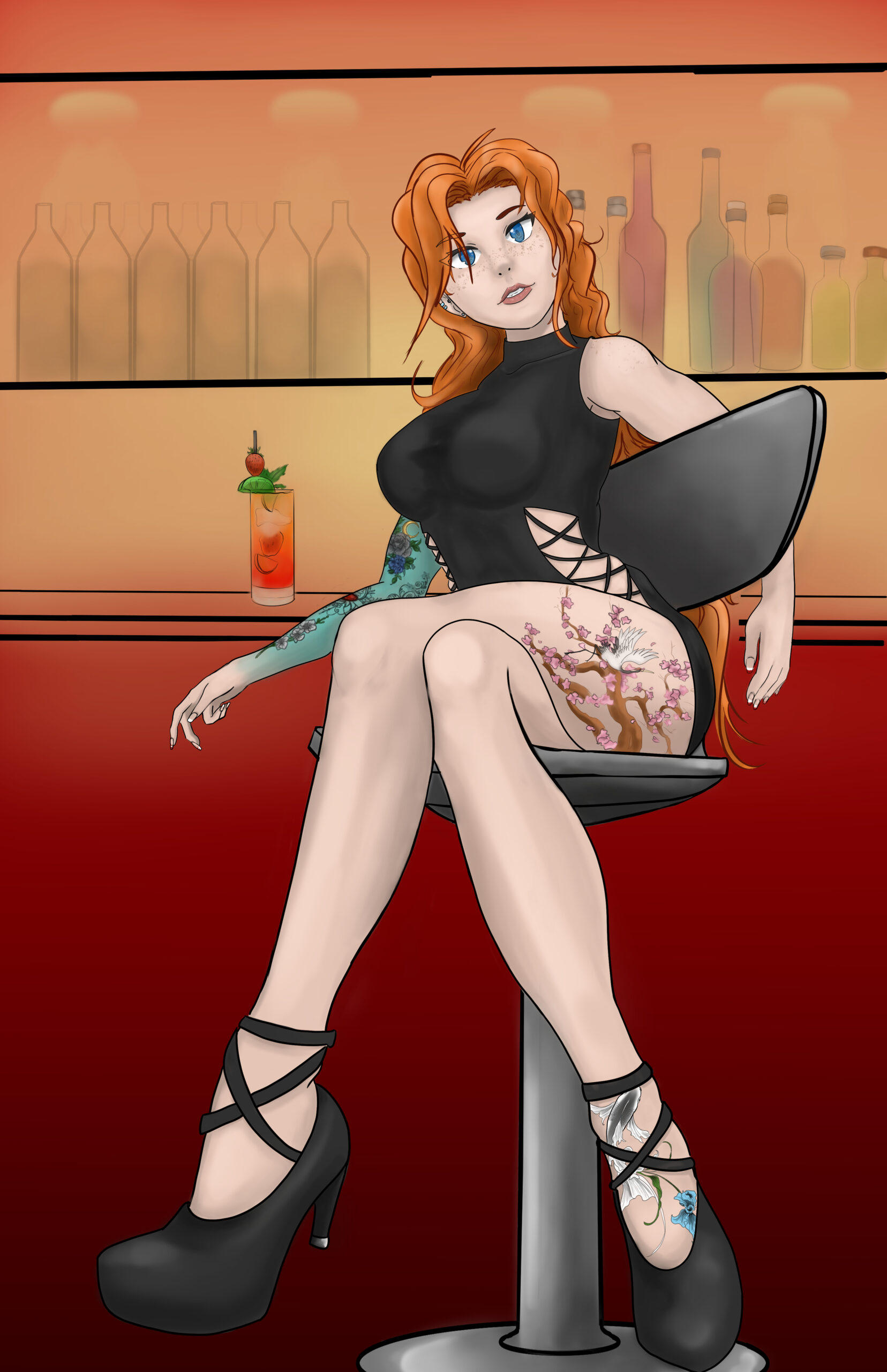
Local Bar Flyer
This custom illustration was created for a local bar’s promotional flyer. The artwork features a striking figure seated at a bar, exuding confidence and style. The vibrant colors and detailed rendering highlight the character’s intricate tattoos and fashionable attire. The scene is set against a warm, inviting background that draws attention to the cocktail and the sleek design of the bar.
This piece was digitally rendered using Clip Studio Paint, with the entire illustration process executed on a Huion Kamvas Pro 16. The character’s pose, the rich textures, and the play of light and shadow were meticulously crafted to capture the ambiance and allure of a modern bar setting.
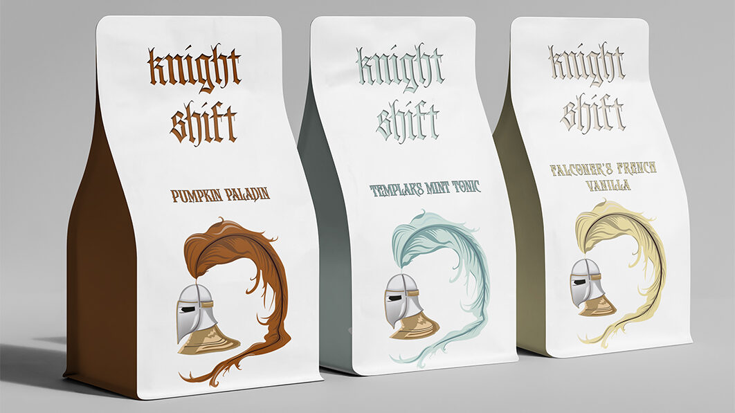
Knight Shift Coffee Branding
This branding concept for “Knight Shift” features custom vector illustrations that align with the specific coffee blend. The color palettes are carefully chosen to reflect the unique characteristics of each blend. The lettering was initially hand-lettered and then converted to vector format for versatility across various applications, ensuring a consistent and cohesive brand identity.
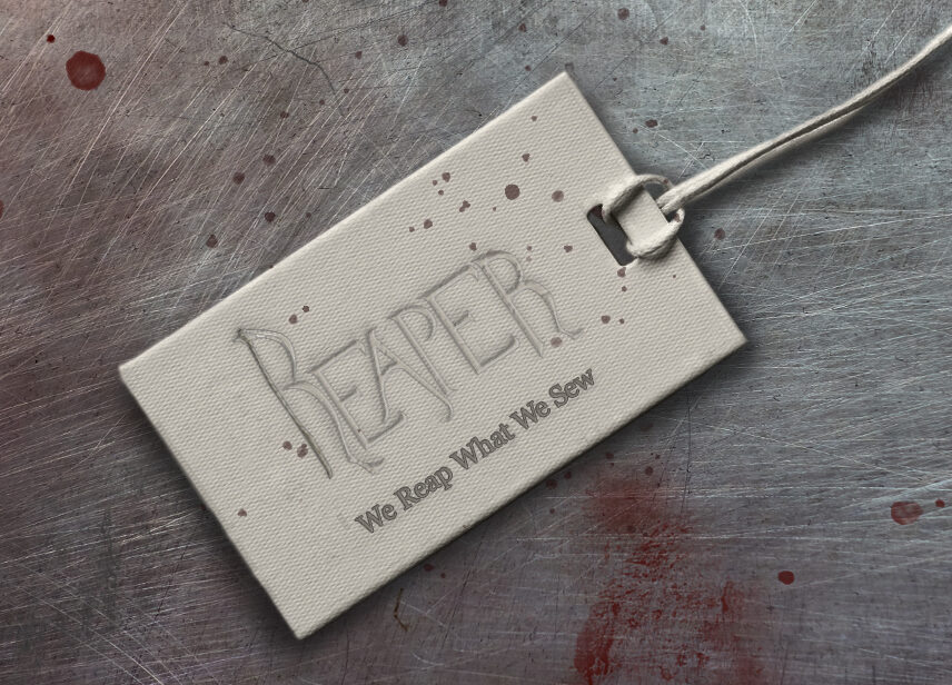
Reaper Clothing Line Branding
This branding concept features hand-drawn original lettering with the “R” illustrated as a scythe to match the theme. The design was then photoshopped into mockups for practical display in a clothing line, showcasing the tagline “Grim Threads for Bold Souls” and the slogan “We Reap What We Sew.” This project combines minimalistic design with a bold, edgy aesthetic, perfect for a daring brand identity.
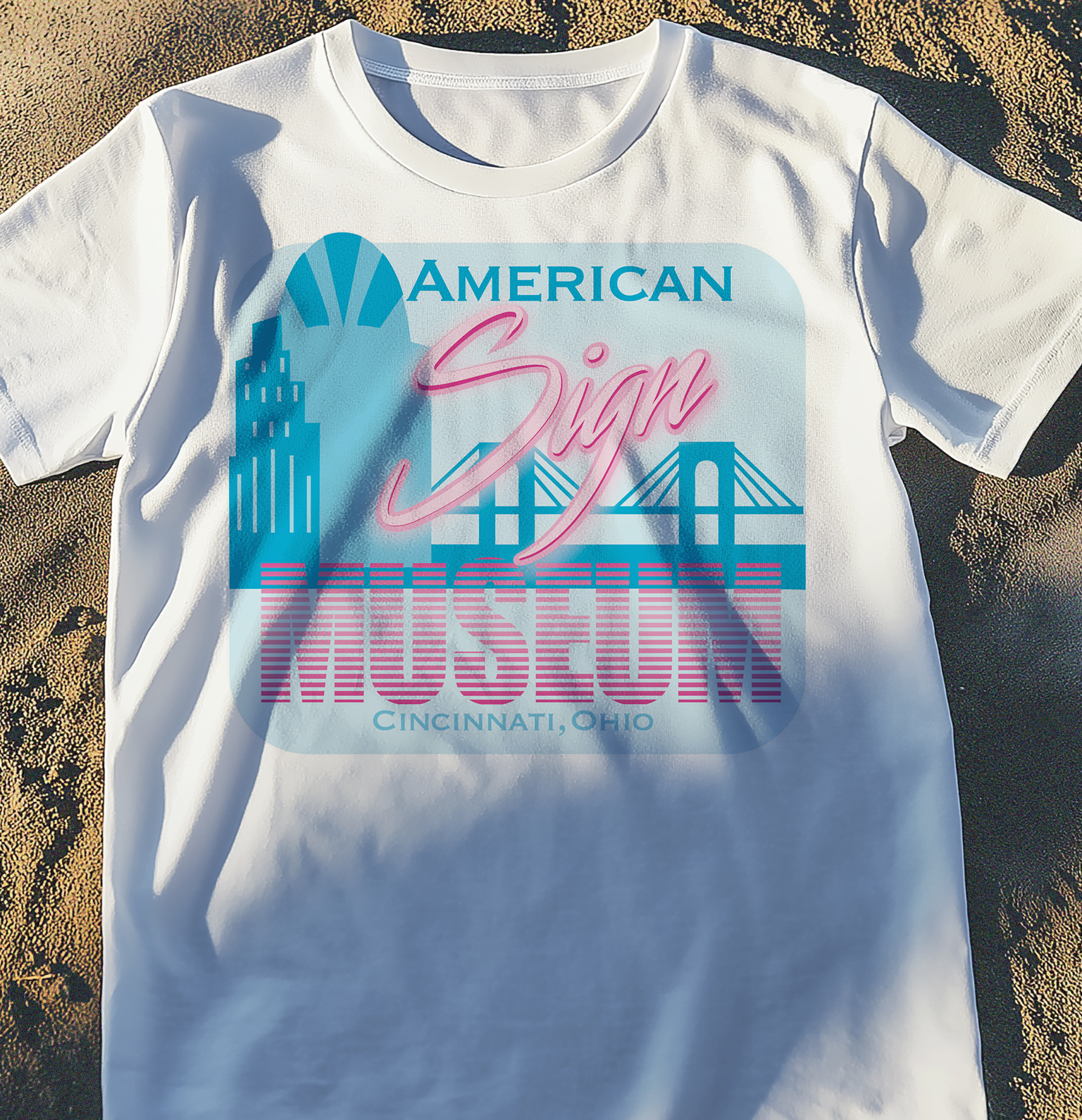
American Sign Museum T-Shirt Screen Print
This custom t-shirt design captures the essence of the American Sign Museum in Cincinnati, Ohio, through a blend of retro aesthetics and modern design techniques. The piece was meticulously crafted using Pantone 2 spot color, ensuring vibrant and consistent hues across the shirt. The city skyline in the background is a unique custom vector illustration, created specifically to reflect Cincinnati’s iconic architecture. The “American Sign Museum” text, prominently featured in the center, was optimized for screen-printing to add depth and texture, evoking the neon signs and classic Americana that the museum celebrates.
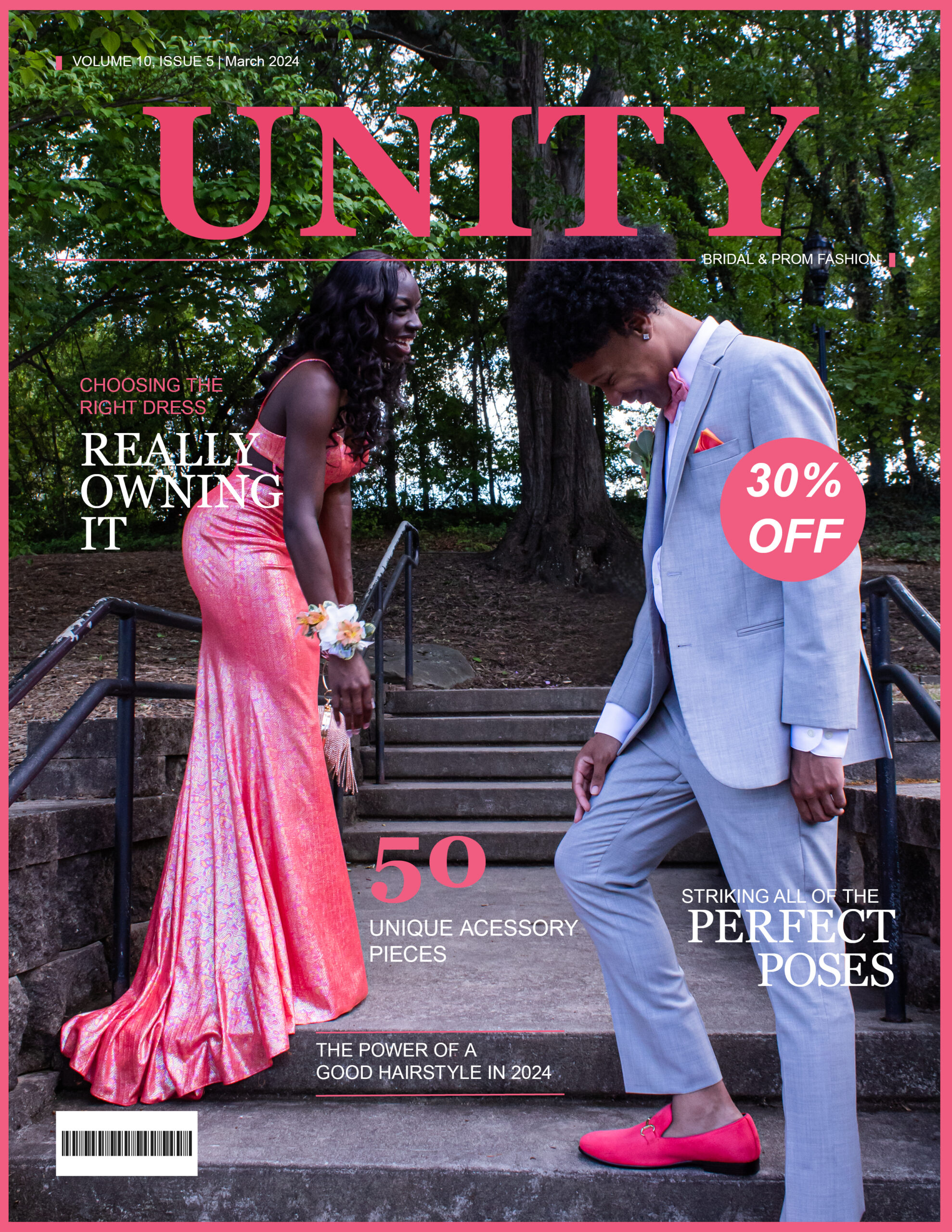
Unity Magazine March Issue
For this magazine cover, I designed the layout using InDesign, focusing on a strong hierarchy in typography. Careful attention was given to kerning and word placement to ensure optimal readability and visual impact. The cover photo was also taken by me, creating a cohesive and well-balanced design that effectively communicates the magazine’s theme.
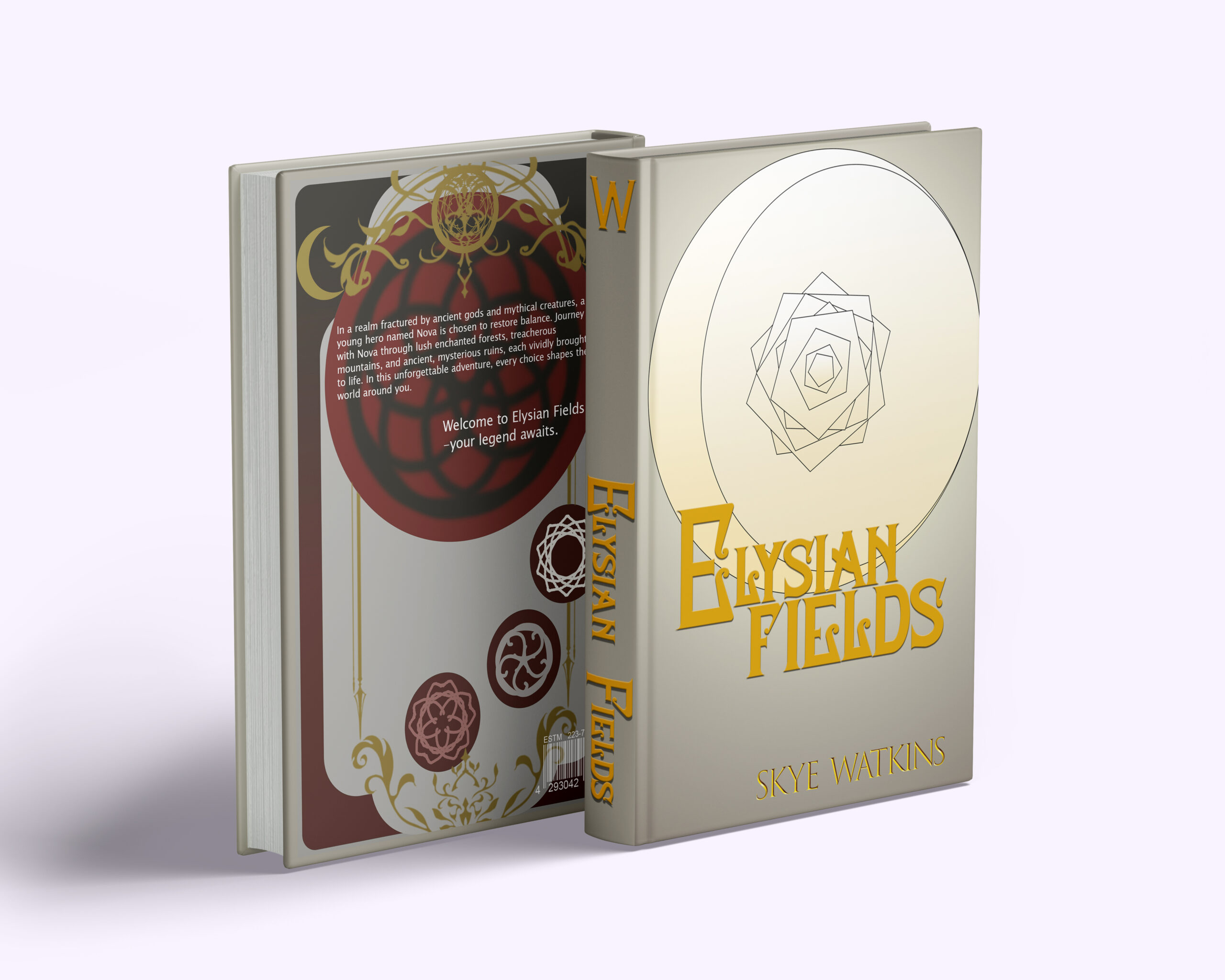
Elysian Fields Book Cover Design
This book cover for Elysian Fields was meticulously crafted to embody the high fantasy themes of the novel. Both the front and back illustrations were created digitally, featuring intricate designs that capture the epic scope and mystical elements of the story. The illustrations were developed using Clip Studio Paint on a Huion Kamvas Pro 16, allowing for precise detailing and a cohesive visual narrative.
The typography was carefully chosen and designed to complement the fantasy genre, with attention to the balance and flow of the title and other text elements on the cover. The overall design is aimed at immersing potential readers into the world of Elysian Fields, enticing them with a glimpse of the adventure that awaits within its pages.
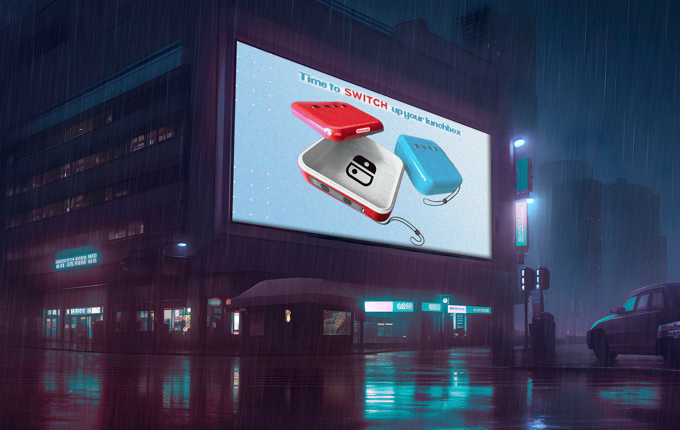
Smeg Nintendo Switch Collaboration
This design blends the iconic colors of the original Nintendo Switch Joycons with the sleek aesthetic of Smeg’s lunchbox. The collaboration aims to create a fun, vibrant product that appeals to children. The design thoughtfully integrates both brands’ styles, ensuring a playful yet cohesive look that captures the essence of both Nintendo and Smeg.
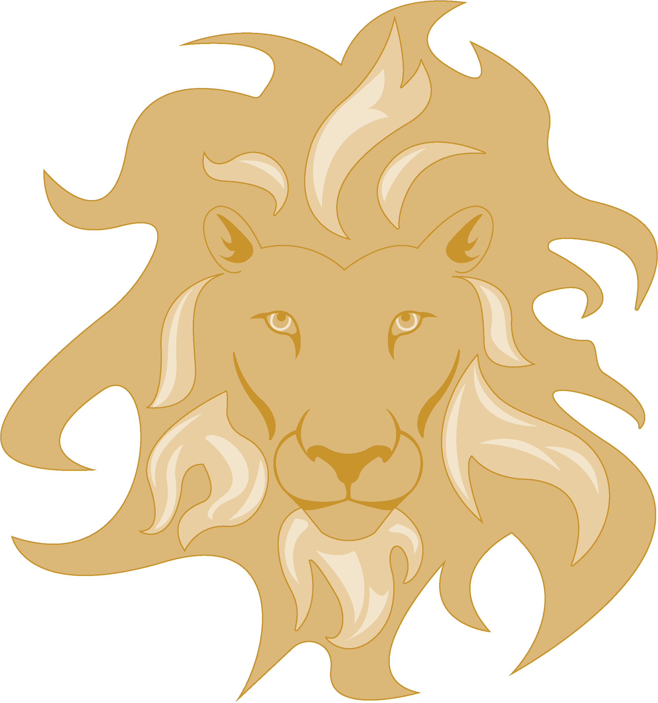
Leo Logo Design
This custom logo for “Leo” features a meticulously illustrated lion head, created using vector imaging. The design captures the brand’s bold and powerful identity, ensuring scalability and versatility across various platforms. The lion head symbolizes strength and leadership, aligning perfectly with the brand’s core values.
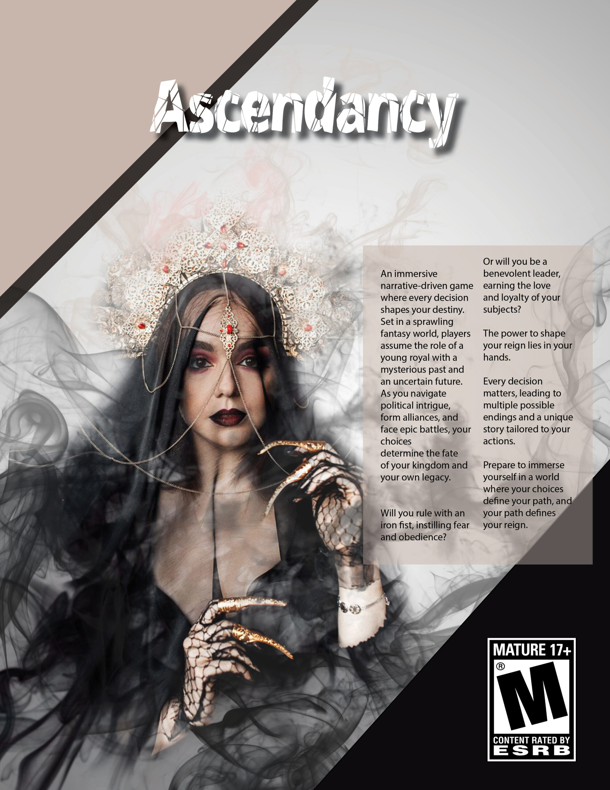
Ascendancy Video Game Flyer
This flyer design for “Ascendancy” showcases advanced techniques like photo manipulation, layer masking, and dispersion effects. These elements combine to create a dynamic and visually striking representation of the game’s intense and immersive atmosphere. The design captures the essence of the game, making it both eye-catching and memorable for potential players.
